1940 - 1977
This is when games first came into being. Games were first made as simulations. So it is not surprising to me that the color was not the most important thing at that point. Here are some examples of games in this time period.
As we can see from these videos, the shapes are very boxy and a very stark, bright white. In the first video it shows color but in reality, it really did not have color this is the model they have in a museum. We can see in the third video that the color came from sheet of plastic film that would stick to the tv, and underneath it is those same stark, bright white boxy shapes. In 1971 atari came out with there first arcade game pong. This pong is not as stark or bright as the one before, in the picture of pong below, the color looks very dingy, the white looks muted and grey.

1977 - 1985
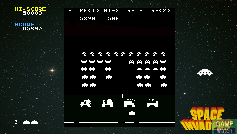
When the first space invaders came out in the arcades it to was in black and white, however it had found the right balance. It was not stark and bright, or dingy and muted. While the graphics were still a little boxy, the color and definition of the lines was very sharp and easy for the gamer to see. This is also true of the asteroids game that came out not to long after.

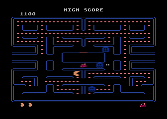
When Atari brought out the Pac-Man game this is when we finally see color in video games. This was a nice change from the black and white. This game uses 8 bit color. The more bits a game system uses, the more options there are to add color. Despite the upgrade in the technology, it is still boxy and the color is muted. The yellow in particular is a very unnatural burnt yellow.
Atari next brought out a home console, so you would think that the colors on it would be about the same as Pac-Man. However the first games that came out were almost a step back in color. This was some of the first technology to be more user friendly and able to be brought into the consumers home. Until the new, much smaller systems could be streamlined, the color suffered and took a back seat to convenience. You can see this in the first few games shown in this video. The Atari uses 8 bits for it's color, which did allow for more than just two or three color options. 
When Nintendo brought out their system it basically saved the industry. Because Atari-compatible games could be designed by anyone, the quality suffered. Nintendo made sure that games for their systems had to be manufactured only by them. This made it easier to maintain good quality controls and have games with uniform standards. In other words, Nintendo took their time with the games, which resulted in the colors looking better than the previous systems. Although the colors look better, the games themselfs are glitchy. This is seen in this video. NES has 16 bits of color memory, which was by far the highest of any game system up to that point. It also allowed for more realistic and vibrant colors instead of the stark palate of colors of their predecessors.
No comments:
Post a Comment